WordPress Plugins for Creators and Online Stores

Category: Gutenberg

  • How to Add a Sticky Call-To-Action (CTA) in Gutenberg Without Breaking Mobile UX

    How to Add a Sticky Call-To-Action (CTA) in Gutenberg Without Breaking Mobile UX

    In conversion rate optimization, proximity matters. When a visitor reaches the middle of a persuasive product review, comparison table, or pricing guide, having an accessible Call-to-Action (CTA) within arm’s reach can increase click-through rates by up to 35%. But there is a dangerous catch: poorly implemented sticky CTAs can destroy your mobile user experience and trigger Google search penalties.

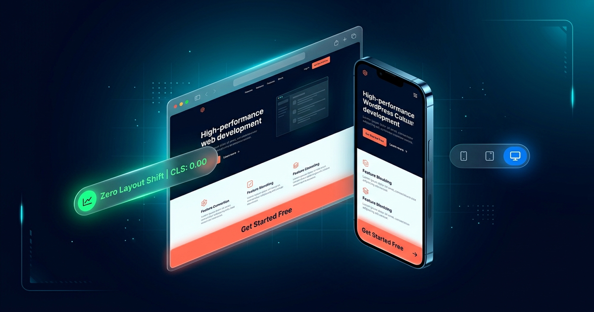
    On small smartphone screens, clunky floating banners often cover 40% of the visible viewport, block essential paragraphs, and cause accidental taps. Worse, jittery JavaScript libraries cause Cumulative Layout Shift (CLS), damaging your Core Web Vitals rankings.

    In this guide, we will examine the principles of high-converting sticky elements, explain why standard CSS often fails on complex layouts, and show you how to build responsive, mobile-safe sticky CTAs in WordPress using WPWing Sticky Block.


    1. The Mobile Sticky Dilemma: Conversion Asset vs. Screen Cannibal

    Desktop screens offer generous margins. A floating sidebar widget or a discreet floating bottom bar leaves plenty of white space for uninterrupted reading. On a mobile device with a 375px or 414px screen width, however, vertical screen real estate is fiercely competitive.

    When mobile floating CTAs go wrong, they create three critical problems:

    • Intrusive Interstitials & Google Penalties: Google’s search algorithms specifically penalize sites that display intrusive overlays obscuring main body text on mobile. If a sticky banner makes content difficult to access, organic rankings drop.
    • Footer & Landmark Collisions: Floating bars that fail to stop before your site footer can awkwardly overlap copyright notices, chat widgets, or legal disclaimers.
    • Fat-Finger Taps & Frustration: Oversized floating buttons that cannot be dismissed trap users in endless misclicks, causing immediate bounces.

    2. Why Native CSS `position: sticky` Falls Short

    Many developers initially attempt to build floating elements using pure CSS: position: sticky; top: 0;. While simple, native CSS sticky has major structural limitations in modern web design:

    Container Boundary Traps

    A native CSS sticky block only stays pinned while its direct parent container is visible on screen. Once the parent container scrolls past, the sticky element scrolls out of view immediately.

    No Scroll Direction Detection

    Pure CSS cannot differentiate between downward reading scrolls and upward navigation scrolls. It cannot reveal a header only when a reader scrolls up.

    No State-Based Restyling

    CSS cannot dynamically add drop shadows, shrink padding, switch background colors, or add dismiss buttons the moment an element becomes stuck without custom JavaScript.

    Zero Mobile Breakpoint Logic

    Disabling sticky behavior on mobile while keeping it enabled on desktop requires writing custom media queries and maintaining manual CSS rules.


    3. The Solution: Intelligent Sticky Elements with WPWing

    To eliminate these roadblocks, we engineered WPWing Sticky Block (Sticky Header & Floating Bar Block) as a native Gutenberg container block. It combines the reliability of position: fixed scroll detection with deep block editor controls:

    • Zero jQuery Dependencies: The frontend runtime script is written in modern, vanilla JavaScript and weighs under 4 KB minified. It will never slow down your site or trigger Core Web Vitals layout shifts.
    • True Container Block: Drop any native block inside, including Gutenberg buttons, navigation menus, countdown timers, search forms, or WooCommerce cart totals.
    • Independent Mobile & Desktop Controls: Configure sticky behavior separately for mobile and desktop screens with custom pixel breakpoints.

    4. Step-by-Step: Building a Mobile-Friendly Floating CTA

    Follow these steps to create a high-converting, mobile-safe sticky CTA on any WordPress page or template:

    Step 1: Add the Sticky Block Container

    Open the Gutenberg block inserter, search for “Sticky Block”, and insert it onto your page. Alternatively, select any existing Group block on your page and transform it directly into a Sticky Block with one click.

    Step 2: Nest Your Call-to-Action Content

    Inside the Sticky Block container, insert a Button block alongside a concise headline. For mobile screens, keep text brief and focused (e.g., “Save 20% on Annual Plans → Claim Deal”).

    Step 3: Configure Position & Scroll Reveal Triggers

    In the block settings sidebar under Sticky Settings:

    • Position: Select Bottom for mobile conversion bars. Bottom-anchored bars sit naturally within the user’s thumb zone for effortless tapping.
    • Reveal Trigger: Choose Scroll Distance and set it to 300px (or 25% of the page). Never display a floating CTA immediately upon page load; let visitors read your value proposition first.
    • Entry Animation: Select Fade + Slide for a smooth, natural entrance that does not distract from reading.

    Step 4: Configure Mobile-Friendly Dismissal & Padding

    This is where most sites fail. To protect your mobile UX:

    • Enable Dismiss Button: Toggle the close button so users can dismiss the bar if they want an unobstructed reading view.
    • Remember Dismissal: Set the dismissal cookie duration to 7 days so visitors who dismiss the bar are not annoyed on subsequent page visits.
    • Sticky-State Padding: Set compact padding (e.g., 10px top/bottom) so the bar occupies less than 15% of the smartphone screen height.

    5. Advanced Tactics: Scroll Direction & Footer Collision Prevention

    For high-traffic commercial websites, two advanced features in WPWing make all the difference:

    Scroll Direction Mode: “Only While Scrolling Up”

    When a visitor scrolls down, they are focused on reading your content. When they stop and scroll upward, they are actively looking to navigate or take action. By selecting the “Only while scrolling up” option, your sticky bar retreats while the reader scrolls down and reappears the instant they scroll upward. This provides the ultimate balance between non-intrusive reading and instant conversion availability.

    Footer Collision Avoidance

    In the Stop Before Element field, enter your theme’s footer CSS selector (such as #footer or .site-footer). When the reader reaches the bottom of the page, the sticky block stops gracefully and unpins itself, preventing ugly overlapping collisions with your footer links.


    6. Frequently Asked Questions (FAQ)

    Will adding a sticky CTA block cause Cumulative Layout Shift (CLS)?

    No. Because WPWing uses optimized fixed positioning and hardware-accelerated CSS transforms rather than inserting dynamic layout spacers, the document flow remains completely stable, resulting in a perfect 0.00 CLS score.

    Does the block adjust for logged-in users with the WordPress admin toolbar?

    Yes. WPWing automatically detects when the WordPress admin bar is present and offsets top-sticky blocks downward by the exact height of the admin toolbar (32px on desktop, 46px on mobile).

    Can I use this for a sticky sidebar that stops at the end of its section?

    Yes. Simply enable the “Stick within parent container” toggle. The sidebar widget will follow the reader down the page, but will stop the moment the parent content column ends.


    Boost Conversions with Non-Intrusive Sticky Design

    A well-timed, responsive Call-to-Action keeps your highest-converting opportunities always accessible without frustrating your mobile audience or hurting your SEO health.

    Ready to build lightning-fast floating headers, cookie bars, and conversion banners? Download Sticky Header & Floating Bar Block by WPWing free on WordPress.org, or explore more examples on the official WPWing Sticky Block page today.
  • Why Table of Contents Blocks Improve Dwell Time and Google Featured Snippets

    Why Table of Contents Blocks Improve Dwell Time and Google Featured Snippets

    Writing in-depth, 2,500-word guides is one of the most reliable ways to build organic search authority. But here is the dilemma every content creator faces: nobody reads long-form articles from start to finish anymore.

    Modern web users scan. Eye-tracking studies show that visitors spend an average of less than 15 seconds assessing whether an article contains the exact solution they need. If they land on an unbroken wall of text without clear orientation, they bounce back to the search results. That bounce sends a negative engagement signal to Google, which degrades your organic rankings over time.

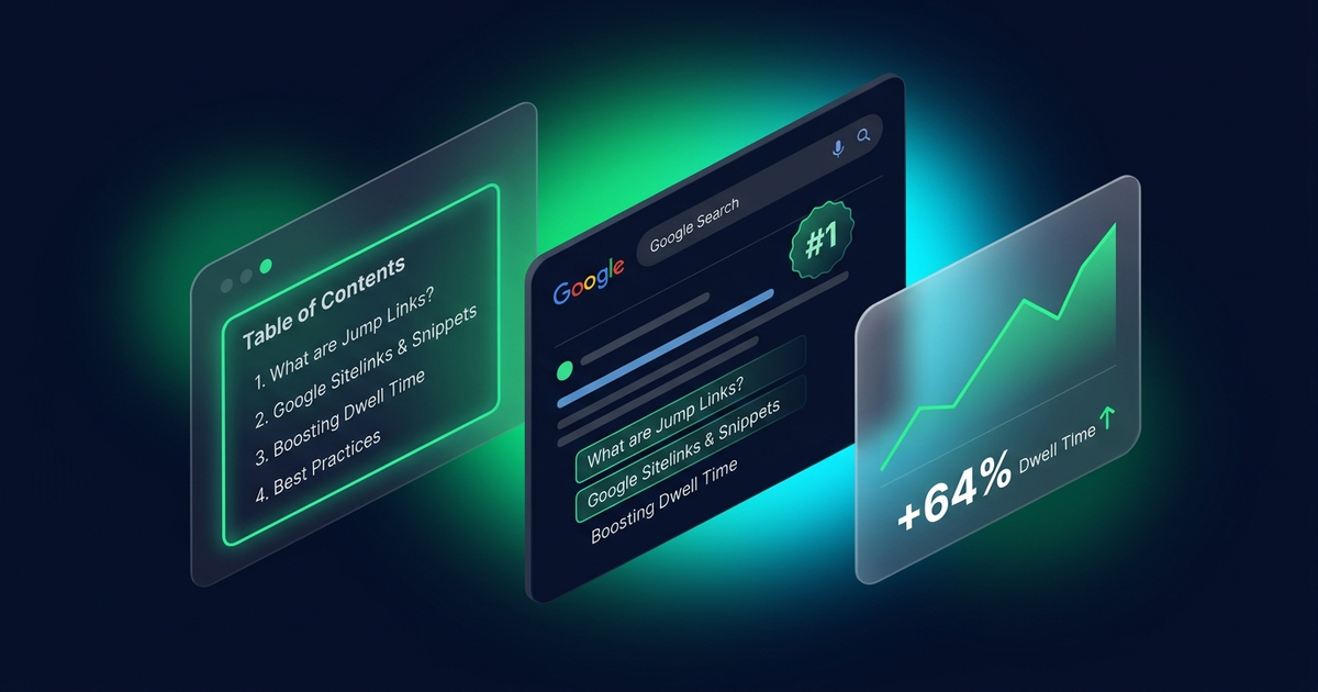
    The solution is not writing shorter content. The solution is giving readers an effortless roadmap. In this guide, we will break down how adding a clean table of contents directly improves dwell time, triggers Google search jump-links and rich snippets, and how to implement a zero-bloat solution using WPWing Table of Contents Block.


    1. The Scannability Crisis: Why Modern Readers Bounce

    When someone types a question into Google, they want a direct answer. They are not reading your post like a novel; they are hunting for specific data points, code snippets, or actionable steps.

    Without a structured navigation menu at the top of the article, readers experience immediate cognitive fatigue. Scrolling past seven introductory paragraphs to locate section four feels like work. A table of contents immediately reassures the visitor that your post covers their exact question, turning a quick bounce into an engaged reader.


    2. How a Table of Contents Directly Increases Dwell Time

    Dwell time measures the duration between a user clicking a search result and returning to the SERP (Search Engine Results Page). A longer dwell time signals to Google’s ranking algorithms that your page satisfied the user’s search intent.

    Immediate Proof of Value

    A table of contents acts as an executive summary. Within 3 seconds of loading, readers see your full outline, proving that your guide is thorough, professional, and trustworthy.

    Frictionless Multi-Section Exploration

    Smooth anchor navigation encourages readers to jump between sections, view related subheadings, and stay on the page longer rather than abandoning their research.


    Beyond human user experience, a table of contents offers significant technical SEO advantages. When you structure your content with proper H2/H3 headings and corresponding anchor tags (id="section-name"), Google crawlers index those anchors individually.

    Have you ever noticed Google search snippets that include sub-links beneath the description stating “Jump to: Section Name”? Google generates these organically when an article has clear heading IDs and an internal anchor table. This makes your search result occupy up to 30% more vertical screen space, drastically increasing organic click-through rates (CTR).

    Google’s passage ranking algorithm isolates specific sections of a long page to answer niche search queries. When your headings are marked with semantic IDs and referenced in a top-level directory, Google can easily parse the exact context of each passage and pull it into position zero (the Featured Snippet box).


    4. The Performance Trap: Why Legacy TOC Plugins Hurt Core Web Vitals

    While the SEO benefits of a table of contents are undisputed, many WordPress site owners inadvertently sabotage their site speed by installing outdated plugins.

    • Heavy jQuery Dependencies: Legacy plugins like Easy Table of Contents were built over a decade ago. Many still load outdated jQuery scripts and inline CSS styles across every page of your site, even on pages that do not have a table of contents.
    • Negative Impact on INP and LCP: Heavy client-side JavaScript execution creates main-thread bottlenecks, degrading your Interaction to Next Paint (INP) score and delaying Largest Contentful Paint (LCP).
    • Database Query Overhead: Some plugins perform complex regex string replacements on post content dynamically on every page load, generating unnecessary server load.

    5. The WPWing Approach: Native Gutenberg with Zero JavaScript by Default

    When developing WPWing Table of Contents Block, our engineering priority was zero bloat and pure block-editor performance:

    • Zero JavaScript by Default: The block generates valid, semantic HTML anchor links entirely server-side in PHP. In standard mode, it loads zero external JavaScript files on your frontend.
    • Ultra-Lightweight Extras: If you enable interactive features (such as collapsible toggles or smooth-scrolling offsets), the plugin injects only a tiny inline script without any external library dependencies.
    • Full Site Editing (FSE) & Native Styling: Built specifically for modern block themes. You can wrap it in standard Gutenberg Group blocks, apply background colors, customize typography, and adjust padding natively.
    • Automated Heading Detection: Automatically scans your content for H2 through H6 headings in real time, eliminating the tedious chore of typing manual anchor tags.

    6. 4 Rules for Structuring Headings for Maximum SEO Impact

    To ensure your table of contents delivers both exceptional user experience and search engine rankings, follow these four foundational rules:

    1. Maintain Strict Hierarchical Order: Always follow a logical order (H2 for main sections, H3 for sub-points). Never skip heading levels (e.g., jumping from H2 directly to H4) as this confuses screen readers and search crawlers.
    2. Front-Load Keywords Naturally: Readers scan the first 2 or 3 words of each heading in the table of contents. Keep headings descriptive and place target search terms near the beginning.
    3. Keep Anchor IDs Clean and Hyphenated: Use clear, lowercase, hyphen-separated IDs (e.g., id="how-to-install") rather than messy autogenerated strings.
    4. Use Ordered Lists for Step-by-Step Guides: In tutorial articles, configure your TOC block to render as an ordered list (<ol>) to clearly convey a sequential process to readers.

    7. Frequently Asked Questions (FAQ)

    Does having a table of contents guarantee Google will display jump-links?

    Google decides algorithmically when to display sitelinks and jump-to links based on search intent. However, providing valid anchor IDs and a structured table of contents gives Google the exact semantic markup required to generate them.

    Should I include a table of contents on every blog post?

    For short posts under 600 words, a table of contents is usually unnecessary. For comprehensive articles containing three or more headings (especially guides over 1,000 words), a table of contents significantly improves readability and dwell time.

    Can I prevent fixed site headers from overlapping anchor headings when users jump?

    Yes. WPWing Table of Contents Block includes an integrated scroll offset setting that automatically applies scroll-margin-top CSS to your headings, ensuring headings land cleanly beneath sticky headers.


    Boost Your Dwell Time and Organic CTR Today

    Improving content engagement does not require redesigning your entire website. By adding a clean, accessible table of contents, you immediately give readers the scannable structure they demand while providing Google with clear anchor points for rich search snippets.

    Ready to upgrade your content readability with zero bloat? Download WPWing Table of Contents Block free from WordPress.org, or explore all features on the official WPWing product page today.

  • Make Any Block Sticky for Better Engagement

    Make Any Block Sticky for Better Engagement

    Sticky elements stay visible as the reader scrolls. Used well, they keep your most important content — a call to action, a sign-up, a promo — in view at the perfect moment.

    Great uses for sticky blocks

    • A persistent call-to-action button
    • An announcement or promo bar
    • A floating table of contents on long posts

    How to do it without code

    With our Sticky Block, you wrap any Gutenberg block and toggle it sticky — set an offset, choose where it stops, and you’re done. No CSS, no custom code.

    A word of caution

    Don’t overdo it. One well-placed sticky element helps; three competing ones annoy. Keep it purposeful.